
Site performance analytics is the discipline of measuring investigator sites against a small set of quality and operational indicators, normalized for fairness, so sponsors can act before a trial falls behind. The single move that matters most: adopt roughly 8 to 12 CtQ-aligned KPIs, normalize each one to a site's activation date and opportunity, and attach every metric to a named owner and a playbook that triggers automatically when a threshold is crossed.
TL;DR:
- Normalizing site enrollment data by activation date and opportunity reduces variance caused by different site start times and patient pools.
- Using a curated set of 8 to 12 KPIs focused on recruitment, data quality, and protocol compliance enables effective daily oversight without overwhelming coordinators.
- Building a trustworthy dashboard requires clear data ownership, version control, and appropriate refresh rates tailored to each indicator type.
- Implementing predefined playbooks with thresholds and actions ensures site issues are addressed proactively rather than reactively.
- Embedding operational teams to connect KPIs, optimize data flow, and guide real-time interventions accelerates trial timelines beyond simple reporting.
Table of Contents
- What Counts as Site Performance Analytics in Clinical Trials?
- Why Do Raw Site Comparisons Mislead Sponsors?
- How Should You Build a Site Performance Dashboard?
- Turning Site Metrics Into Action: A Playbook Template
- How Do You Collect and Integrate Site Performance Data?
- What Are the Best Practices for Data Quality Assurance?
- What Real-Time Monitoring and Alerting Looks Like
- What Do Effective Site Performance Analytics Programs Look Like?
- HaiPhai Perspective: From Dashboards to Real Time Savings
- How HaiPhai Turns Site Analytics Into Faster Trials
- Sources
- FAQ
What Counts as Site Performance Analytics in Clinical Trials?
Site performance analytics is not a dashboard of vanity numbers. It is a scoped set of metrics tracking how well an individual site executes against protocol, timeline, and data quality expectations, built to trigger action rather than just produce a report. A systematic review of multicenter trial monitoring identified 87 candidate metrics across six categories, then narrowed the practical recommendation to a much smaller working set for routine oversight.
That narrowing matters more than the initial list. Five metric categories cover nearly everything a clinical operations director needs to watch day to day.
- Recruitment: enrollment per month, enrollment relative to site activation and opportunity, and funnel conversion (eligible → approached → consented → randomized).
- Retention: withdrawal rate, visit completion rate, and follow-up adherence against the visit schedule.
- Data quality: queries per participant, first-pass case report form (CRF) acceptance rate, and CRF entry timeliness (days from visit to entry).
- Protocol compliance and safety: protocol deviations per 100 visits, and serious adverse event (SAE) reporting timeliness against the regulatory clock.
- Operational health: activation timeline (contract to first patient in), query aging (days open, not just count), and investigational product or device reconciliation accuracy.
Each category answers a different operational question. Recruitment tells you whether a site can deliver volume. Data quality tells you whether that volume is trustworthy. Protocol compliance and safety tell you whether the site is executing the study as designed, which is the one category regulators care about most. A site can enroll fast and still be your riskiest site if its query aging and deviation rate are climbing quietly underneath the enrollment curve.
Why Do Raw Site Comparisons Mislead Sponsors?
Comparing raw enrollment counts across sites is close to meaningless, because sites activate on different dates and draw from different patient populations. A site opened six weeks later than its peers will always look worse on a cumulative chart, even if its underlying performance is strong. Normalizing to activation date and opportunity corrects for this and meaningfully reduces the variance that protocol complexity and differing patient pools introduce.
Three normalization approaches cover most sponsor needs.
- Per-month rate: enrollment divided by months active since activation, not months since the trial started.
- Enrollment per opportunity: enrolled patients divided by the eligible screening population the site actually has access to, not an assumed catchment.
- Z-score against trial median: expresses a site's rate as standard deviations from the median, flattening outliers caused by unusually large or small catchments.
Anonymized benchmarking turns these numbers into something sites can act on rather than resent. Sponsors that share comparative context (where a site sits relative to the de-identified median) alongside leading indicators give sites the ability to self-correct before a formal report lands, instead of finding out three months later that they were falling behind. Keep the number of KPIs shown to a site capped at 8 to 12. Past that, sites and sponsors both stop reading the dashboard closely.
Pro Tip: Show each site its own normalized trend line next to the anonymized trial median, not a ranked leaderboard. Leaderboards trigger defensiveness; trend lines against a benchmark trigger problem-solving.
How Should You Build a Site Performance Dashboard?
A dashboard is only as trustworthy as the data pipeline underneath it. Every KPI needs a clear, single system of record, or two sites will quietly report the same metric two different ways.
- Map each KPI to its authoritative source. Enrollment and visit data live in the EDC; randomization and drug supply status live in the IRT; patient-reported outcomes live in the eCOA; sample and assay turnaround live in the LIMS; site contracts and activation dates live in the CTMS.
- Version the formula, not just the number. Log when a KPI's calculation changes (a new deviation category, a redefined "opportunity" denominator) so a trend line never silently breaks.
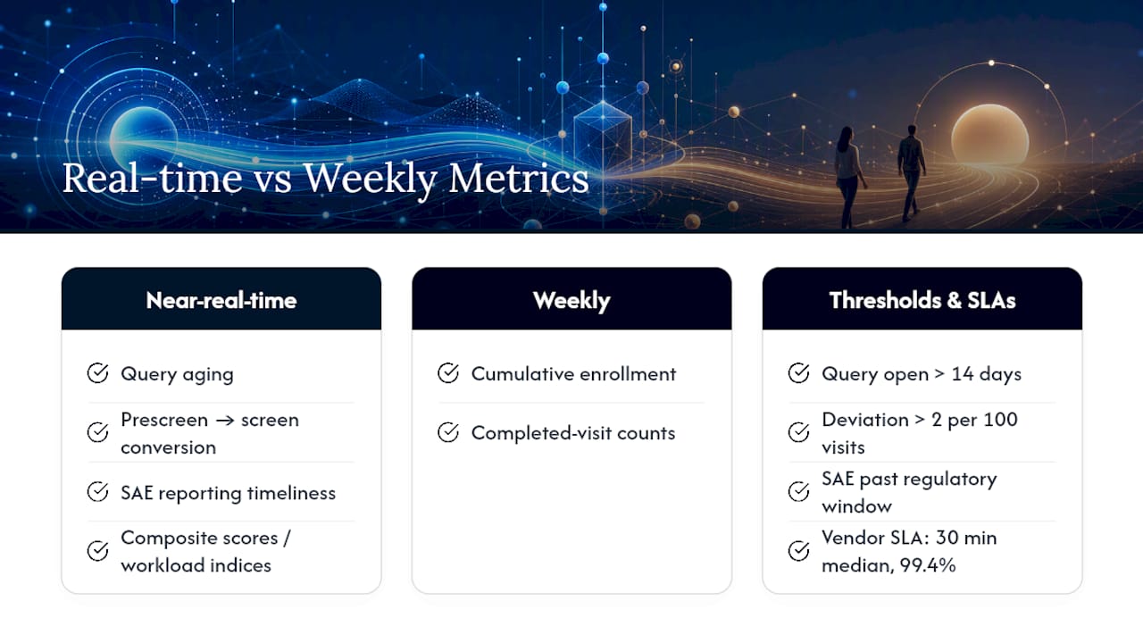
- Set refresh cadence by indicator type. Leading indicators like query aging or prescreen-to-screen conversion need near-real-time or daily refresh; lagging indicators like cumulative enrollment can refresh weekly without losing value.
- Design for action, not admiration. A traffic-light summary up top, trendlines beneath it, and drill-down detail below that, plus a metric glossary so a new site coordinator does not have to guess what "first-pass acceptance" means.
The CT-SPM validation work is a useful proof point here: researchers reduced 126 candidate indicators down to an 18-item measure, then to a brief short form, and built a working prototype dashboard that computed composite scores directly from structured EDC exports. That is the direction most sponsor dashboards should move: fewer numbers, sharper triggers, less scrolling.
Dashboards should also feed directly into your Monitoring Plan and Quality Tolerance Limits (QTLs) under risk-based monitoring. A KPI that breaches its threshold ought to fire the same QTL escalation a monitor would flag on a site visit, not sit as a static chart nobody revisits until the next quarterly review.
Turning Site Metrics Into Action: A Playbook Template
A KPI without a predefined response is just a number someone will eventually notice too late. Metrics tied to a CtQ factor and an action plan are the ones that actually change site behavior; everything else is retrospective reporting.
Build every KPI around six fields: trigger threshold, owner, first-line action, timeline to resolution, escalation threshold, and evidence of remediation. A query aging playbook might read: trigger at 14 days open, owner is the clinical research associate (CRA) assigned to the site, first-line action is a same-week call to the site coordinator, timeline is 5 business days to resolution, escalation triggers at 21 days to the clinical trial manager, and evidence is the query closure timestamp in the EDC.
- Run monthly site reviews as coaching sessions, not report-outs. Document specific commitments with names and due dates attached.
- Prioritize your team's attention using leading indicators. Query aging and prescreen-to-screen conversion surface a problem weeks before cumulative enrollment or deviation counts would show it.
Pro Tip: Write the playbook before the trial starts, not after the first site misses a target. A playbook drafted mid-crisis always ends up punitive; one drafted in advance reads as support.
How Do You Collect and Integrate Site Performance Data?
Most of the real difficulty in site performance analytics is not the math. It is getting clean, comparable data out of five or six systems that were never designed to talk to each other.
EDC platforms hold visit and CRF data, IRT systems hold randomization and supply, eCOA holds patient-reported endpoints, LIMS holds lab turnaround, and the CTMS holds contracts and activation dates. Each system uses its own site identifiers, its own timestamp conventions, and often its own definition of a "completed visit." Reconciling those before a KPI ever reaches a dashboard is the unglamorous work that determines whether the analytics are trustworthy.
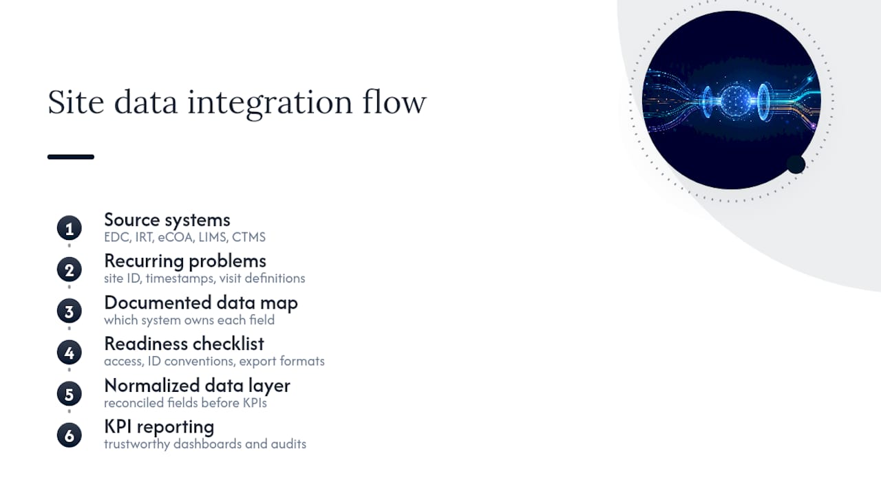
Three integration problems recur across most sponsor organizations. First, site ID mismatches between the CTMS and EDC cause enrollment numbers to double count or drop entirely during data pulls. Second, timestamp inconsistency (local site time versus UTC, or date-of-visit versus date-of-entry) skews timeliness metrics like CRF entry lag. Third, manual exports from LIMS or imaging vendors introduce lag that makes a "real-time" dashboard real-time in name only.
The fix is rarely more software. It is a documented data map, agreed at study start, specifying exactly which system owns each field and how conflicts get resolved. A checklist-driven approach to site readiness at activation, covering system access, ID conventions, and export formats, prevents most of these mismatches before they ever reach a dashboard. Sponsors who skip this step tend to discover it the hard way, usually during an audit when two systems disagree on enrollment count for the same site.
What Are the Best Practices for Data Quality Assurance?
Data quality assurance in site analytics comes down to catching errors close to the source, not downstream in a monthly report. First-pass CRF acceptance rate is the single best early signal of a site's underlying data discipline; a site with a first-pass acceptance rate dropping below its trial median usually shows other quality problems within a few weeks.
Build validation rules into the EDC itself wherever possible, so obviously implausible entries (a visit date before consent, a dose outside protocol range) get flagged at entry rather than during query resolution weeks later. Assign a single, named owner to each KPI's data definition, with version control on the formula and a documented change process tied to the monitoring plan. Without that ownership, two study team members will eventually calculate "query aging" two different ways, and nobody will notice until the numbers stop matching.
Regular source data verification (SDV) sampling still matters, but risk-based, targeted SDV, focused on sites with declining first-pass acceptance or rising deviation rates, catches more real problems per hour spent than blanket 100% SDV ever does. Cross-check EDC entries against the IRT and CTMS on a fixed schedule (weekly for enrollment counts, monthly for contract and activation dates) rather than only during formal interim reviews. The goal is a data pipeline where the dashboard number and the source system number always match, because the moment a site or auditor catches a discrepancy, trust in the entire analytics program erodes fast.
What Real-Time Monitoring and Alerting Looks Like
Real-time monitoring does not mean every metric updates by the second. It means leading indicators refresh fast enough to trigger action before a lagging metric confirms the problem was real. Query aging, prescreen-to-screen conversion, and SAE reporting timeliness belong in that near-real-time tier; cumulative enrollment and completed-visit counts can refresh on a weekly cadence without losing operational value.
Threshold-based alerting works better than raw trendlines for busy clinical operations teams. Set a hard trigger (query open more than 14 days, deviation rate above two per 100 visits, SAE reporting past the regulatory window) and route the alert directly to the KPI's named owner rather than into a general inbox that gets triaged once a week. A proof-of-concept dashboard built on structured EDC exports demonstrated that composite scoring and workload indices can be computed and visualized close to real time once the underlying data pipeline is clean, which is usually the harder half of the problem.
Third-party vendors add their own latency to watch. Imaging and central lab turnaround times are a common blind spot; one partner benchmark for STAT radiology reads reports a 30 minute median turnaround with a 99.4% service-level agreement, which is the kind of vendor SLA that should feed directly into your operational dashboard as its own tracked metric rather than being assumed. Alert fatigue is the real risk once thresholds are live. Keep alerting scoped to the 8 to 12 core KPIs and resist the urge to add a trigger for every metric the EDC happens to report.
What Do Effective Site Performance Analytics Programs Look Like?
The clearest illustration in the published literature comes from the CT-SPM validation work, where researchers built a composite measure across participant-facing and data-facing domains and tested it in a live multicenter dashboard prototype. The short form (a few items, down from 126 candidate indicators) let coordinators screen for underperforming sites quickly, reserving the fuller metric set for follow-up investigation only where the short form flagged a concern. That two-tier structure (screen fast, investigate deep) is the pattern most sponsor programs eventually converge on once they stop trying to monitor everything at once.
A separate Delphi consensus process arrived at a similar conclusion independently: a core set of a core set of metrics spanning recruitment, retention, data quality, and protocol compliance, visualized with simple traffic-light thresholds rather than dense tables. Both efforts land on the same number range this article recommends (8 to 12 core KPIs) because that is roughly the ceiling of what a busy site coordinator or clinical research associate can act on without the dashboard becoming background noise.
The common thread across both examples is not the specific metrics chosen. It is the discipline of testing a small set, validating it against real trial data, and building the interface around action (a short form for screening, a traffic light for triage) instead of around completeness for its own sake.
HaiPhai Perspective: From Dashboards to Real Time Savings
Most site analytics programs stall at the dashboard. The numbers are right, the traffic lights work, and nothing changes operationally because no one owns the follow-through. This approach treats the dashboard as the starting point, not the deliverable: an embedded team carries the playbooks directly into daily site operations, applies AI to speed up the drafting and reconciliation work sitting behind each KPI, and stays accountable for whether the metric actually moves. Some clients have reported reclaiming significant operational time on the path to approval. That gap, between measuring a problem and someone owning its fix, is where most analytics investments quietly fail.
— John
How HaiPhai Turns Site Analytics Into Faster Trials
Building the KPI set is the easy part. Making it stick inside a live trial, across sites that each have their own habits and shortcuts, is where most sponsor teams lose months they never get back. That is the gap Haiphai's operational partnership closes: an embedded team that defines your 8 to 12 CtQ-aligned KPIs, wires the data pipeline across EDC, IRT, eCOA, and CTMS, and stays on the ground to run the monthly playbook reviews this article describes.
The engagement starts with an AI Velocity Diagnostic, which maps where your current site operations are losing time before any dashboard gets built. From there, Haiphai's Five Stage Site Feasibility process addresses activation timing directly, one of the biggest sources of the normalization headaches covered earlier in this article. Rather than handing you a reporting tool and stepping back, Haiphai's solutions integrate governed automation and institutional knowledge into your existing team, so the metrics translate into actual timeline compression instead of another dashboard nobody opens by month three. If your site performance program is stuck at reporting instead of results, start with the diagnostic and see where the operational time is actually going.
Sources
- Monitoring performance of sites within multicentre randomised trials: a systematic review of performance metrics
- When metrics measure more than they improve | pharmaphorum
FAQ
How Many KPIs Should a Site Performance Dashboard Track?
Most published consensus work points to roughly 8 to 12 core metrics, drawn from a larger candidate pool of 87, or a validated short form of as few as a few items for initial screening.
Why Does Normalizing Enrollment Matter?
Raw enrollment counts penalize sites that activated later or serve smaller eligible populations. Normalizing to activation date and site opportunity removes that bias and reduces cross-site variance.
What Is a Leading Indicator in Site Performance Analytics?
A leading indicator, like query aging or prescreen-to-screen conversion, signals a developing problem before it shows up in a lagging metric such as cumulative enrollment, giving teams time to intervene early.
Does HaiPhai Build Site Performance Dashboards?
Haiphai does not sell standalone dashboard software. It works as an embedded operational partner that defines your KPI set, integrates the underlying data pipeline, and runs the playbooks that turn those metrics into faster site execution, detailed on its services page.
What Systems Feed a Site Performance Dashboard?
The core sources are the EDC for visit and CRF data, the IRT for randomization and supply, the eCOA for patient-reported outcomes, the LIMS for lab turnaround, and the CTMS for contracts and activation dates.