
An effective regulatory dashboard must present the decision a user needs to take within one screen, prioritized by role and risk. That means a submission tracker, a regulatory calendar, and a signal intelligence feed working together, not three disconnected tools. The guiding principle is answer first, then evidence: show the decision, then let users drill into the data that supports it.
TL;DR:
- Track seven scorecard measures: dossier completeness, inspection readiness, overdue actions, time to submission, review cycle time, active signals, and high risk assets; document each calculation.
- A study across firms reported 40% less report generation time and 32.7% higher dossier completeness, while pilot alerts detected changes up to six weeks earlier.
- Capture a baseline before rollout, prototype with one product line or region, and expand only after real users validate the workflow and governance controls.
- Normalize product and dossier names, use immediate updates for urgent signals, and keep AI alerts under human review with ongoing performance monitoring.
- Give executives portfolio summaries, dossier managers access to supporting documents, and audit staff linked records, with permissions tailored to each role and exportable views.
Table of Contents
- Core components and modules to include
- How should a compliance dashboard be designed to drive decisions?
- Data architecture, integration, and governance
- Visualization patterns and widgets that actually get used
- Which metrics and KPIs actually belong on a regulatory scorecard
- User roles, permissions, and how views should adapt
- Implementation roadmap: phased rollout and change management
- What practitioner experience and research show about dashboard outcomes
- Methods to identify and prioritize operational bottlenecks in regulatory workflows
- Integrating AI and automation for predictive analytics and workflow optimization
- Measuring the real impact of dashboard adoption on timelines and efficiency
- Customizing dashboards for different company sizes and regulatory complexity
- Techniques for continuous feedback and iterative dashboard improvement
- Should you build a regulatory dashboard in-house or bring in a partner?
- How HaiPhai supports regulatory dashboard and workflow design
- FAQ
- Sources
Core components and modules to include
A regulatory dashboard earns its place on someone's desktop by shortening the distance between a question and an action. Each module should map to a specific decision a regulatory professional has to make this week, not just a category of data worth displaying.
A global submission tracker belongs at the center. Built as a Gantt or Kanban view, it should let a dossier manager drill through to module-level eCTD status without opening a separate system. A regulatory calendar sits next to it, consolidating renewal dates, authority meeting windows, and submission obligations across markets so nothing slips through a gap between regional teams.
Signal intelligence is the module that separates a static reporting tool from a working regulatory dashboard. NLP-curated alerts on guideline changes and inspection findings, tied directly to the assets they affect, let a regulatory lead see which products need attention before a deadline becomes a crisis.
Three more modules round out a functional build:
- Portfolio impact matrix: a cross-product view that plots regulatory risk against commercial opportunity, so leadership can see where to direct scarce regulatory affairs capacity.
- Compliance KPI scorecards: a compact set of metrics, covered in more detail further down, that gives every stakeholder a shared read on program health.
- Audit and inspection readiness panel: a module with evidence links attached to each requirement, so a reviewer can move from a readiness score to the supporting document in one click.
These modules only deliver value together. A submission tracker without a signal intelligence feed tells you what is due, not what has changed around you. A KPI scorecard without drill-through evidence becomes a number nobody trusts enough to act on.
How should a compliance dashboard be designed to drive decisions?
Design choices determine whether a dashboard gets opened once during a demo or used every week. The rules below come from how regulatory teams actually work under deadline pressure, not from generic dashboard theory.
- Lead with the decision, not the dataset. The top of the screen should show what needs action today: overdue items, at-risk submissions, new signals, not a wall of charts that requires interpretation before it means anything.
- Build separate hierarchies for separate audiences. An executive sponsor needs a portfolio-level summary in three or four numbers; a dossier manager needs the operational detail behind those numbers. Trying to serve both with one layout dilutes the dashboard for everyone.
- Use progressive disclosure for evidence. Summary tiles should expand into supporting detail on click, not force every user to navigate through five menus to confirm a figure is correct.
- Make every artifact exportable. Auditors and inspectors work from documents, not live screens, so every view needs a clean export path that preserves context.
- Validate with real users before you scale. A dashboard that looks right to its designers can still fail the people who have to use it under a submission deadline.
That last point matters more than most teams assume. Prototyping with domain experts, rather than guessing at their workflow, is what separates a dashboard people adopt from one they route around.
Pro Tip: Run your first prototype review with the people who will use the audit readiness panel under real deadline pressure, not with stakeholders reviewing it in a quiet meeting room.
Data architecture, integration, and governance
None of the visualization work above matters if the data underneath it is inconsistent or unverifiable. A regulatory dashboard is only as trustworthy as its data pipeline, and regulatory data arrives from more sources than most other business functions have to reconcile.
A canonical data model is the starting point. Mapping incoming data to a shared standard, such as IDMP for product identification, prevents the same substance or dossier from appearing under three different labels across systems. Without that normalization, a portfolio impact matrix becomes misleading the moment two regional teams name the same product differently.
Integration patterns need to match the nature of the source. Some feeds, like eCTD submission status, tolerate batch ETL on a daily cycle. Others, like inspection findings or signal alerts, need event-driven updates so a critical change does not sit in a queue overnight. Validation controls at each ingestion point catch malformed records before they reach a KPI calculation and distort a trend line.
Governance is not an afterthought layered on at the end; understanding HIPAA breach notification requirements is essential when designing compliant regulatory systems. Role-based access control, full audit trails on every data change, and AES-256 encryption for data at rest and in transit are baseline expectations for systems holding sensitive regulatory information, and these controls need to be part of the architecture from day one rather than retrofitted after a security review flags a gap.
Scaling introduces its own requirements:
- A cloud-native warehouse that can absorb new data sources without a full rebuild.
- CI/CD pipelines for analytics code, so a metric definition change deploys with the same rigor as any other production system.
- Version control on metric definitions themselves, so a KPI calculated one way in Q1 doesn't quietly change meaning by Q3.
FDA guidance on predetermined change control for machine learning-enabled systems reinforces this point directly: deployed models need ongoing performance monitoring, and any change plan should be risk-based, evidence-based, and transparent across the system's full lifecycle. That principle applies cleanly to any AI-driven signal intelligence module sitting inside a regulatory dashboard.
Visualization patterns and widgets that actually get used
The right chart type depends on the decision it supports, not on what looks most sophisticated in a design review. A few patterns cover most regulatory use cases well.
- Heatmaps work best for portfolio risk: color intensity across products and markets lets a reviewer spot trouble areas in seconds, with tooltips and filters revealing the source evidence behind any single cell.
- Gantt or timeline views suit the submission lifecycle, showing where a dossier sits relative to its deadline and surfacing bottlenecks before they become late filings.
- Kanban boards fit teams managing many parallel submissions, where status transitions matter more than calendar dates.
- Portfolio impact matrices plot risk against opportunity on two axes, helping leadership decide where to put limited regulatory affairs resources next quarter.
- KPI cards with drill-through give a single number on the surface and the underlying detail one click away, which keeps a summary view honest.
For portfolios with dense cross-references, between products, regulations, and jurisdictions, a graph-based navigation layer can outperform a flat table. LegiScout's visual approach to complex legislation demonstrates how force-directed graphs, semantic search, and clickable links to primary text improve comprehension of relationships that a spreadsheet would bury. Adapting that pattern for cross-agency regulatory mapping gives users a way to explore dependencies instead of hunting through rows.
Mixing these patterns on one screen, rather than picking a single chart type and forcing every metric into it, is usually what separates a dashboard that gets referenced daily from one that gets ignored after the first week.
Which metrics and KPIs actually belong on a regulatory scorecard
A scorecard works only when every number on it changes someone's next action. A short, well-chosen set beats a crowded one.
Core metrics worth tracking: dossier completeness percentage, inspection readiness score, count of overdue actions, time-to-submission, average review cycle time, number of active regulatory signals, and the percentage of high-risk assets in the portfolio. Each should have a clear calculation method documented alongside it, so a number means the same thing to every team that reads it.
A multi-firm study of regulatory intelligence dashboards found a roughly 40% reduction in report-generation time and a 32.7% increase in dossier completeness scores after deployment, with AI-driven alerts detecting critical guideline changes up to six weeks earlier than manual monitoring in pilot settings. That gap between manual and AI-assisted detection is often the clearest signal that a signal intelligence module is paying for itself.

Watch trend direction as much as the raw number. A dossier completeness score that holds steady while overdue actions climb usually points to a bottleneck somewhere upstream of the dashboard itself.
User roles, permissions, and how views should adapt
A dashboard that shows the same screen to every user is solving the wrong problem. Regulatory work splits cleanly into roles with different questions, and the interface should reflect that split rather than forcing everyone through one generic view.
- Executive sponsors need a portfolio summary: overall risk posture, major upcoming deadlines, and budget or timeline exposure, with no requirement to drill into document-level detail.
- Regulatory leads need the submission tracker and signal intelligence feed front and center, since they are the ones deciding how to respond to a new guideline change.
- Dossier managers need module-level eCTD detail and the ability to drill from a summary tile straight to the document that supports it.
- QA and audit staff need the inspection readiness panel with evidence links already attached, since their job is verification, not discovery.
Permissions should mirror this split. Role-based access control limits who can see sensitive evidence versus summary figures, and every access event needs to log into an audit trail, both for internal accountability and for inspection readiness itself. Collaboration features, comments, task assignment, sign-off workflows, should route through the same permission layer so evidence review stays traceable from first draft to final approval.
Implementation roadmap: phased rollout and change management
A dashboard rollout that tries to launch fully built, fully integrated, and portfolio-wide on day one is the version most likely to stall. A phased approach gets something useful into users' hands early and earns the trust needed for the harder integration work later.
- Phase 0, discovery. Map stakeholders, inventory existing data sources, and identify which decisions the dashboard needs to support first.
- Phase 1, prototype. Build a minimum viable dashboard for one product line or region, get it in front of real users, and measure whether it changes how they work.
- Phase 2, integrate. Add more data feeds, automate the ETL pipelines that were manual in the prototype, and harden governance controls before expanding access.
- Phase 3, scale. Roll the dashboard out across the full portfolio, add AI-driven signal alerts, and shift from periodic review to continuous monitoring.
Change management runs alongside every phase, not after it. Training needs to cover not just how to click through the interface but how to interpret a KPI trend and when to escalate. SOPs should get updated to reference the dashboard as the system of record for the metrics it tracks, and adoption itself needs its own KPI, login frequency, drill-through usage, time from alert to action, so the rollout team can tell whether the dashboard is actually changing behavior or just sitting open in a browser tab. Our guide to redesigning regulatory affairs workflows walks through how this phasing plays out when the underlying process, not just the dashboard, needs rework.
What practitioner experience and research show about dashboard outcomes
The IJRMP multi-firm study on regulatory intelligence dashboards offers some of the clearest published evidence that this design approach pays off. Teams that combined AI-driven signal alerts with governed, human-reviewed workflows saw faster reporting and more complete dossiers, and the pilots showed that earlier detection of guideline changes translated directly into fewer last-minute scrambles.
The practical lesson from engagements we have run alongside regulatory teams matches that finding closely: start with one product line, measure time-to-value honestly before expanding scope, and keep AI alerts under human governance rather than letting them trigger action on their own. A dashboard that surfaces a signal still needs a qualified person deciding what it means. Our work on where AI fits in regulatory affairs goes into more detail on which tasks belong to automation and which need to stay with experienced staff.
Methods to identify and prioritize operational bottlenecks in regulatory workflows
Finding a bottleneck usually starts with tracing a single submission end to end and timing each handoff, rather than looking at aggregate cycle-time averages that hide where delays actually accumulate. A dossier that sits in QA review for ten days while drafting took three is a different problem than one where drafting itself is slow, and the dashboard's drill-through views should make that distinction visible without a separate investigation.
Dependency mapping helps prioritize once bottlenecks are visible. A delay in a single high-impact submission, one feeding a pivotal approval or a major market launch, deserves attention before a similar delay in a lower-priority filing, even if both show the same number of overdue days on a scorecard.
Workload distribution is another common source of hidden bottlenecks. A regulatory lead managing twelve active submissions will move slower on each than one managing four, and a dashboard that shows individual and team-level load alongside submission status makes that imbalance obvious instead of buried in a spreadsheet nobody checks.
Root-cause patterns tend to repeat across a portfolio once a few quarters of data accumulate. A recurring delay at the same handoff point, say, between regulatory writing and QA sign-off, points to a process gap rather than a one-time staffing issue. Reviewing bottleneck data quarterly, not just when a submission is already late, is what turns a dashboard from a status report into an improvement tool.
Integrating AI and automation for predictive analytics and workflow optimization
AI earns its place in a regulatory dashboard by handling pattern detection at a scale no team could sustain manually, not by replacing judgment on regulatory strategy. NLP-driven signal intelligence scanning new guidance documents and inspection databases is the clearest example: it flags relevant changes faster than manual monitoring and routes them to the people who need to act.
Predictive elements extend naturally from there. Historical cycle-time data can flag a submission at risk of missing its deadline weeks before the date itself, giving a regulatory lead time to reallocate resources instead of reacting after the fact. That kind of forecasting only works when the underlying historical data is clean, which loops back to the data governance controls covered earlier.
Workflow automation handles the repetitive connective tissue around regulatory work: populating dashboard fields from source systems, routing a completed module for review, generating a draft report from structured data. Our practical playbook on regulatory writing use cases covers where this kind of automation reliably saves time in drafting work specifically.
FDA guidance on predetermined change control plans is directly relevant here: any machine learning component embedded in a dashboard, signal detection included, needs ongoing performance monitoring and a transparent, risk-based plan for how it will be updated over time. Treating an AI alert module as a one-time deployment rather than a continuously monitored system is a common and avoidable mistake.
Measuring the real impact of dashboard adoption on timelines and efficiency
Impact measurement needs a baseline captured before rollout, not an estimate reconstructed afterward. Teams that skip this step end up unable to say whether a timeline improvement came from the dashboard or from an unrelated process change that happened around the same time.
The clearest signals to track are the ones tied directly to dashboard function: report-generation time, dossier completeness scores, and the lag between a guideline change occurring and someone on the team noticing it. The IJRMP study ties these three metrics together well, showing report-generation time dropping roughly 40% and dossier completeness scores rising by 32.7% in multi-firm pilots where AI-assisted dashboards replaced manual tracking.
Operational efficiency shows up in secondary indicators too: fewer emergency escalations near submission deadlines, less time reconciling conflicting data between teams, and faster onboarding for new regulatory staff who can see portfolio status without weeks of tribal knowledge transfer. None of these are as easy to quantify precisely as report-generation time, but they tend to move in the same direction once a dashboard is actually being used rather than just available.
The honest caveat is that a dashboard alone does not fix a broken workflow underneath it. Measuring impact means separating what the dashboard changed from what the dashboard merely revealed, a distinction worth building into any post-rollout review.
Customizing dashboards for different company sizes and regulatory complexity
A ten-person biotech preparing its first IND has fundamentally different dashboard needs than a multinational with twenty products across regional regulatory frameworks, and the same off-the-shelf layout rarely serves both well.
Smaller, earlier-stage organizations typically need fewer modules configured more simply: a submission tracker, a regulatory calendar, and a basic readiness panel often cover the full workload, with signal intelligence scoped narrowly to the specific indication or product class in development. Overbuilding at this stage, adding portfolio matrices for a single-product company, wastes setup effort on complexity that has no use case yet.
Larger organizations with multi-market filings need the opposite emphasis: portfolio-level views, cross-jurisdiction regulatory calendars, and signal intelligence tuned to multiple regulatory authorities simultaneously. The data architecture also scales differently, since a single-product company might run comfortably on batch ETL, while a large portfolio often needs event-driven updates to keep signal alerts current across every market at once.
Regulatory complexity, not just company size, should drive the customization decision. A mid-sized company running trials across several jurisdictions with divergent requirements may need the same sophistication as a much larger organization, while a large company with a narrow, well-understood regulatory pathway may need less. Matching dashboard scope to actual complexity, rather than to headcount, keeps the build proportionate to the problem it solves.
Techniques for continuous feedback and iterative dashboard improvement
A dashboard built once and left alone drifts out of sync with how a team actually works within a few months. Regulatory requirements shift, team structures change, and a module that seemed essential at launch can quietly become clutter nobody opens.
Structured feedback loops catch this early. Short, recurring check-ins with the people using the dashboard daily, not an annual survey, surface friction points while they are still small enough to fix cheaply. Watching actual usage data, which modules get opened, which filters get used, which exports get generated, often reveals more than asking users directly, since people are not always aware of which parts of a tool they have quietly stopped relying on.
Iteration works best in small, frequent releases rather than large infrequent overhauls. A minor adjustment to how the audit readiness panel surfaces evidence links can ship in a week and get immediate feedback, while a major redesign risks disrupting workflows people have already built habits around.
Version control on both the dashboard's metric definitions and its visual layout matters for the same reason it matters in the underlying data architecture: a KPI calculation that changes silently between quarters undermines trust in every number on the screen. Our case study on audit-ready clinical trial dashboards walks through how traceable iteration works in a regulated setting where every change needs a documented rationale.
Should you build a regulatory dashboard in-house or bring in a partner?
Building in-house gives full ownership but demands sustained investment in data engineering, UX design, and governance expertise most regulatory teams were never staffed to provide. Partnering trades some of that ownership for speed and for governance maturity that would otherwise take years to develop internally.
A few signals tend to favor partnering: a portfolio complex enough that workflow redesign matters as much as the dashboard itself, a need for AI-driven signal intelligence governed properly from the start rather than bolted on later, and pressure to show measurable time recovery within a quarter rather than a year. Whichever path a team chooses, the partnership should deliver embedded expertise and a clear, measured reduction in operational time, not just a new interface layered over the same underlying process. Our decision framework for choosing between a fractional partner and an internal team lays out the tradeoffs in more depth.
— John
How HaiPhai supports regulatory dashboard and workflow design
We start from a different question than most dashboard vendors: not "what should this screen show," but "what is actually slowing down your path to approval." Our AI Velocity Diagnostic maps the operational bottlenecks behind a regulatory timeline before we touch a single interface, and our governed automation work embeds AI-driven signal intelligence and workflow redesign directly into your clinical, scientific, and regulatory operations, with senior expertise and continuous governance built in rather than handed off after launch.
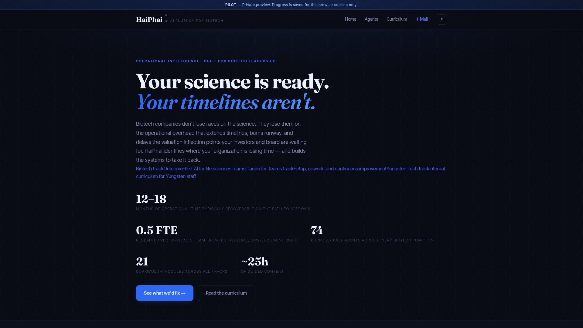
Clients working with us on these engagements have reclaimed significant operational time on their path to approval, time that matters directly for funding timelines and valuation. If a dashboard project keeps stalling on data integration or governance questions nobody on staff has bandwidth to own, explore our services page to see how an operating partnership works in practice.
FAQ
What is a regulatory dashboard?
A regulatory dashboard is a centralized interface that consolidates submission status, compliance deadlines, inspection readiness, and regulatory signals into views tailored to different roles. Its purpose is to let regulatory, clinical, and executive stakeholders see what needs action without pulling data manually from multiple systems.
What are some good designs for dashboards?
Strong regulatory dashboard designs lead with the decision a user needs to make, using heatmaps for portfolio risk, Gantt or Kanban views for submission timelines, and KPI cards with drill-through for detail. Graph-based navigation, as described in LegiScout's work on visualizing complex legislation, also helps when regulatory relationships are too interconnected for a flat table.
What are the best practices for dashboard design?
Best practices include an answer-first layout that surfaces decisions before raw data, separate views for executive and operational audiences, progressive disclosure for supporting evidence, and exportable artifacts for audits. Validating the design with real users through prototyping, rather than finalizing it in isolation, consistently produces a tool people actually adopt.
What is a compliance dashboard and what is its purpose?
A compliance dashboard tracks an organization's adherence to regulatory obligations, surfacing overdue actions, audit readiness scores, and active risk signals in one place. Its purpose is to turn scattered compliance data into a tool that supports timely decisions rather than a static report reviewed after the fact.
How much time can a regulatory dashboard actually save?
Published results vary by organization and scope, but a multi-firm study found roughly a 40% reduction in report-generation time and a 32.7% increase in dossier completeness scores after deploying AI-enabled regulatory dashboards in pilot settings. Actual savings depend heavily on data quality and how well the dashboard's modules match the team's real workflow.
Sources
- Designing Regulatory Intelligence Dashboards for Pharma Portfolio
- Predetermined change control plans for machine learning-enabled medical devices: guiding principles | FDA
- LegiScout: A Visual Tool for Understanding Complex Legislation (arXiv)